BAST MIX
A Bloody Good Time to Drink
IDENTITY and PACKAGING
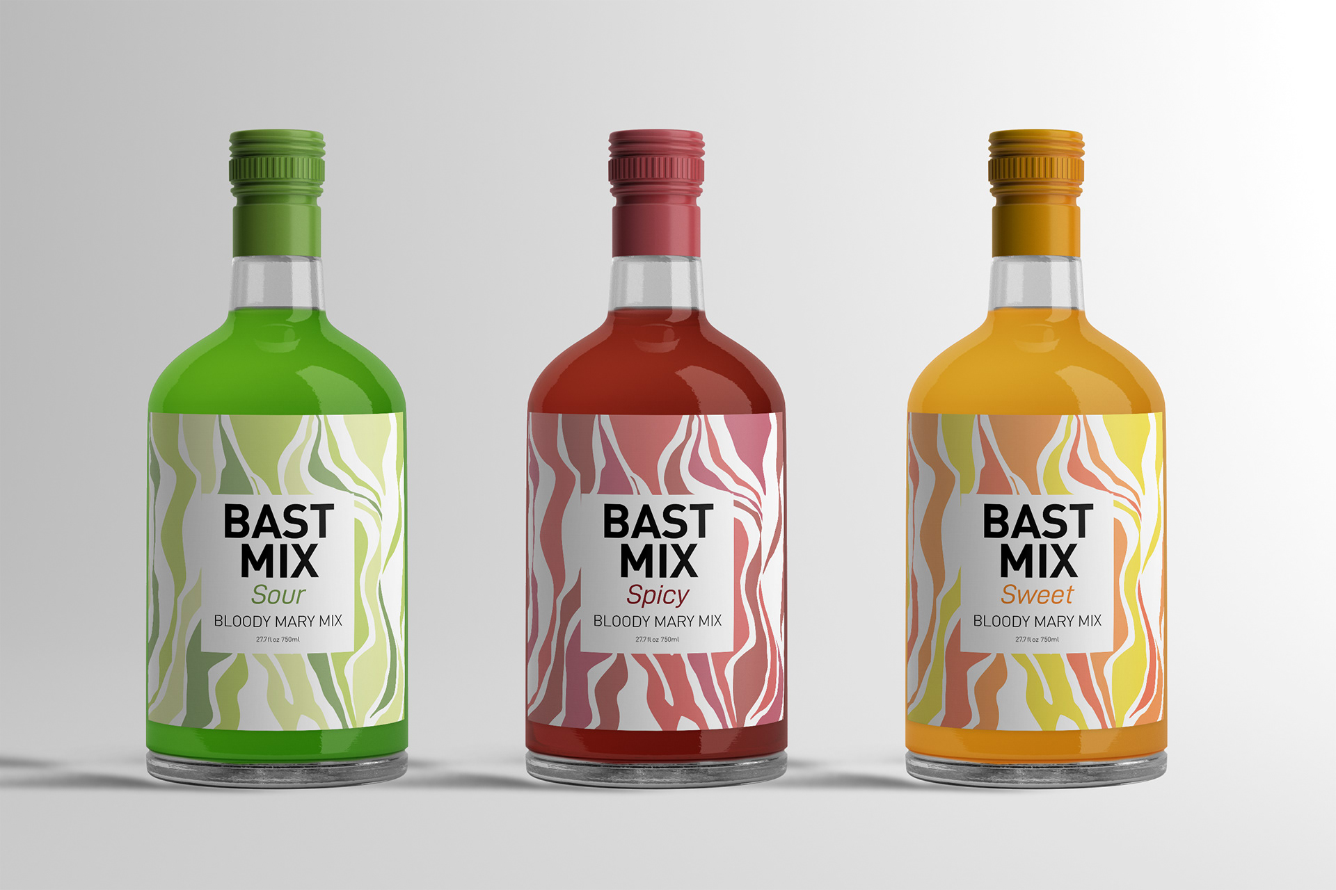
The challenge The Bast family is the main inspiration for this and its base off their recipes for Bloody Marys. This project was to create a brand and package that show off different flavors of Bloody Mary Mix. To show patterns and typography working together.
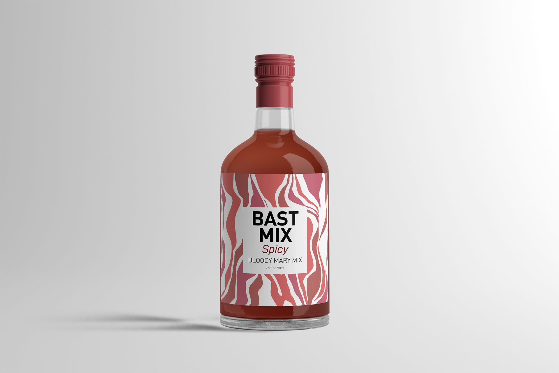
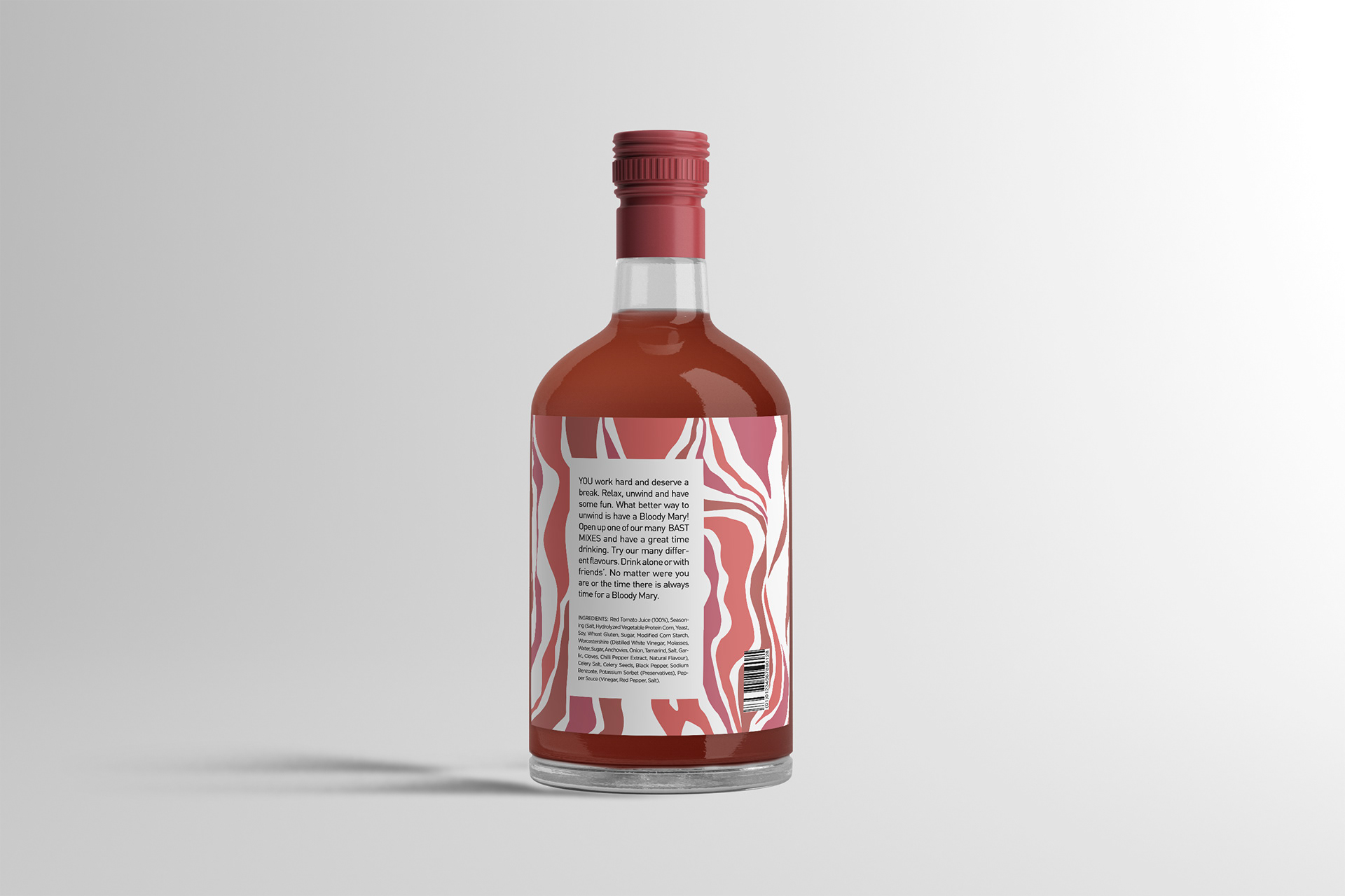
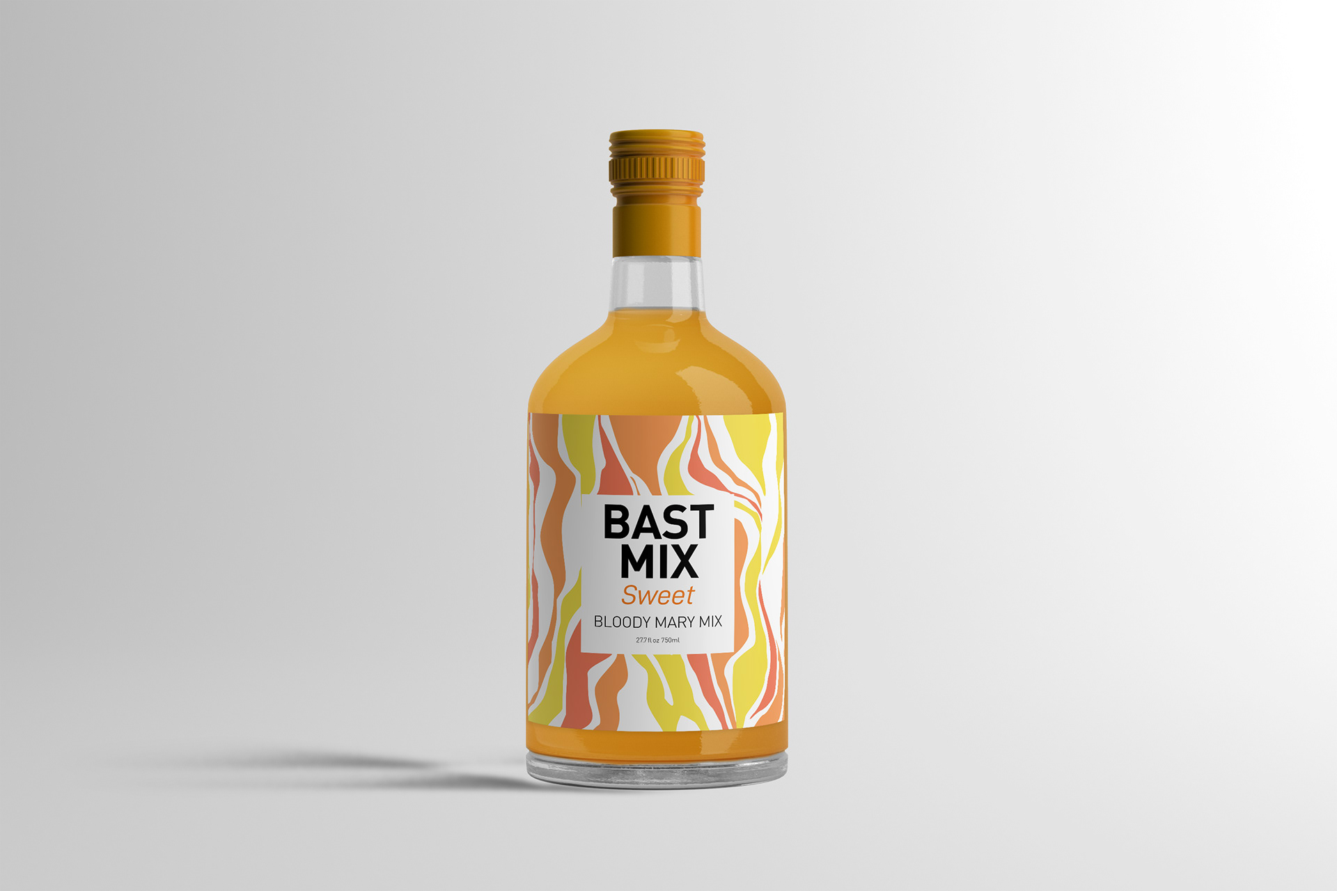
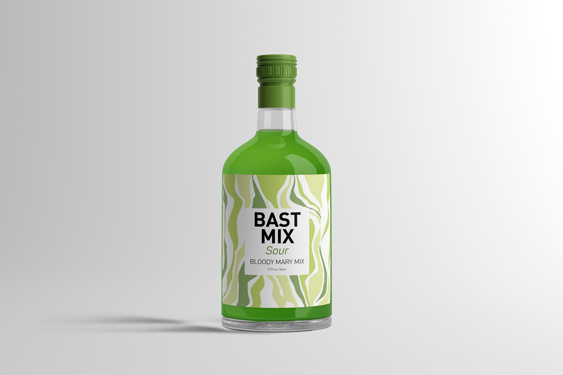
The solution To create a pattern that wasnt's to distracting and would stand out. Each one of these color patterns are base of the different types of Tomato's. Green because it has a sour taste to it. Orange for it's sweet taste. Red because it has a spicy taste. The type had to work, so using a simple and clean typeface made the package stand out more.
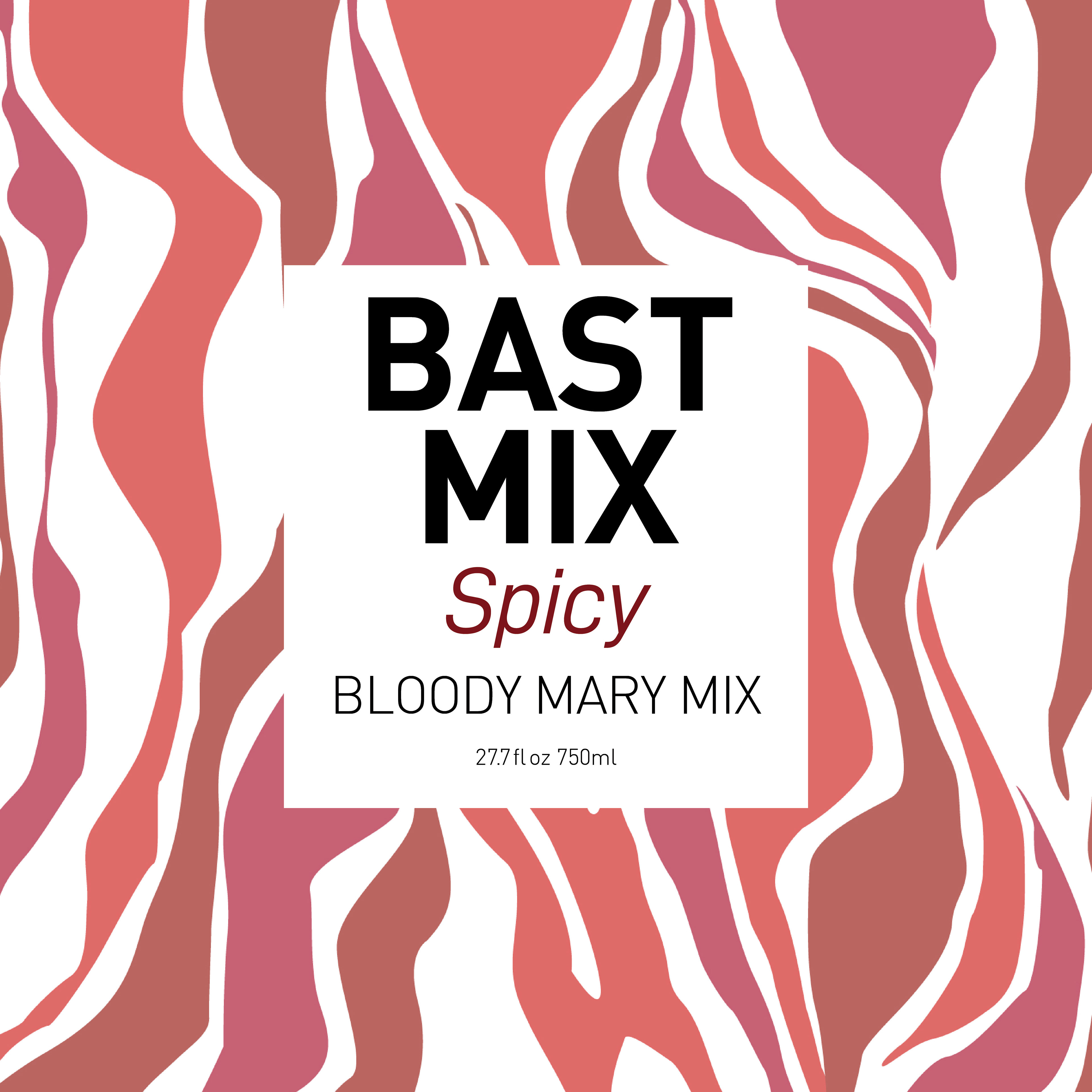
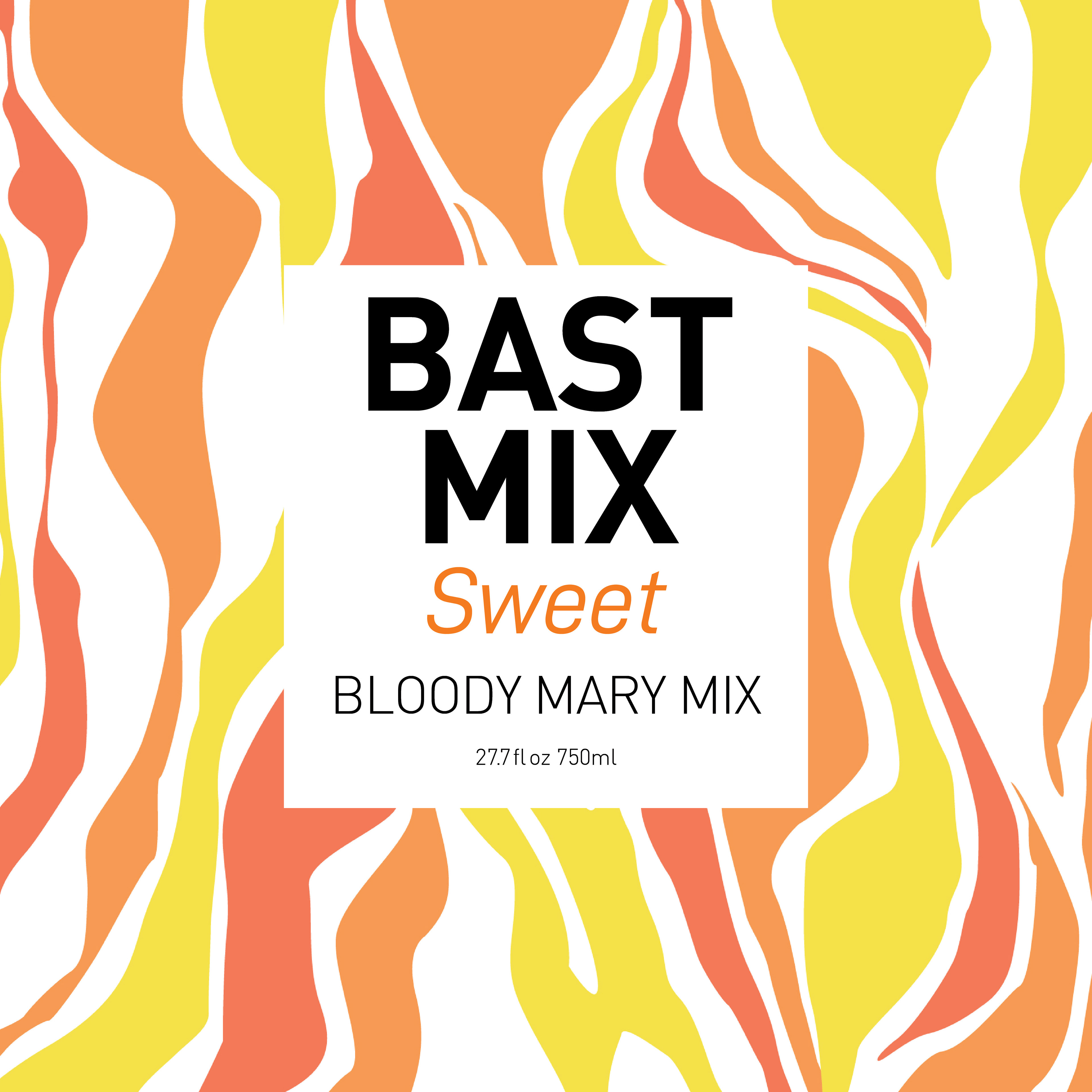
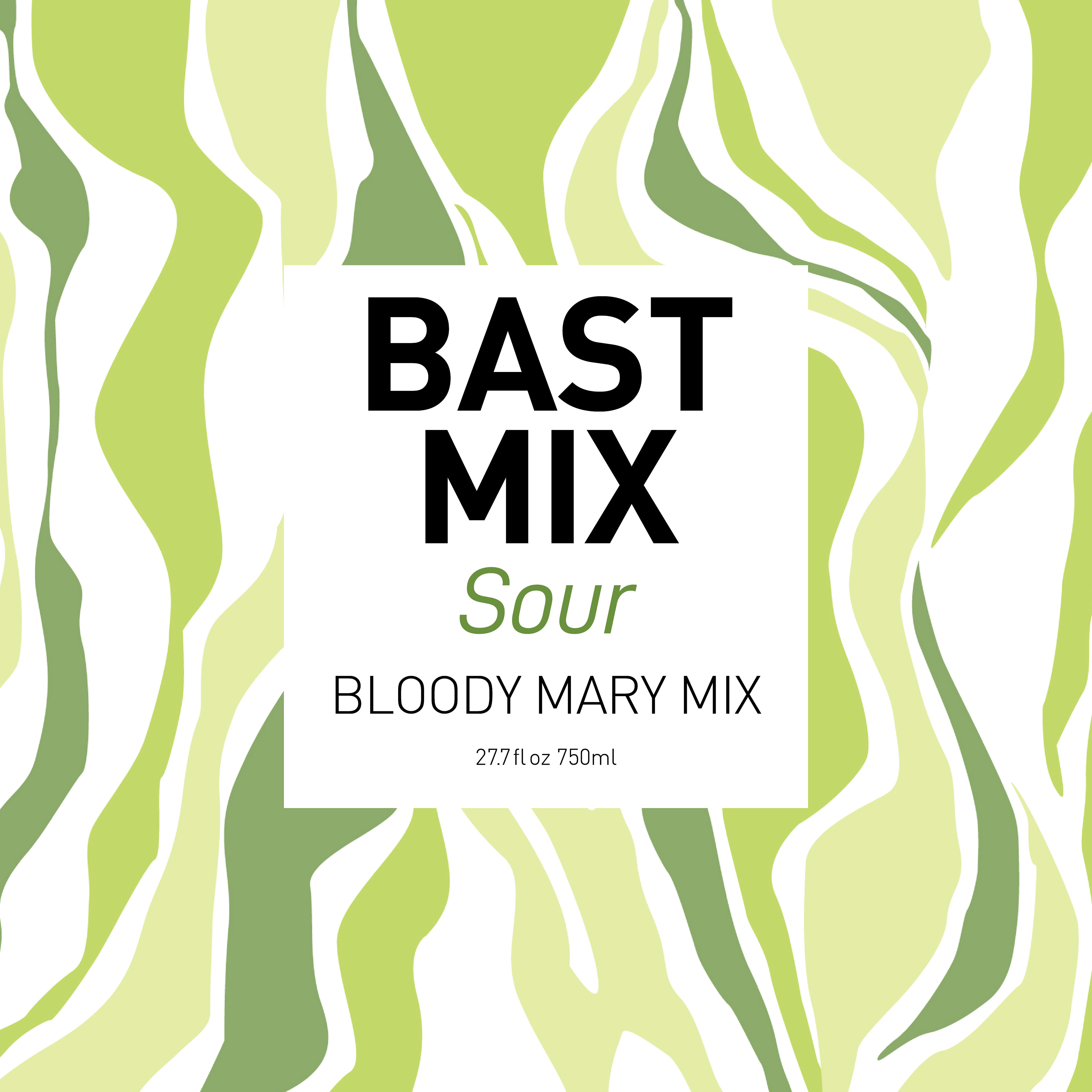
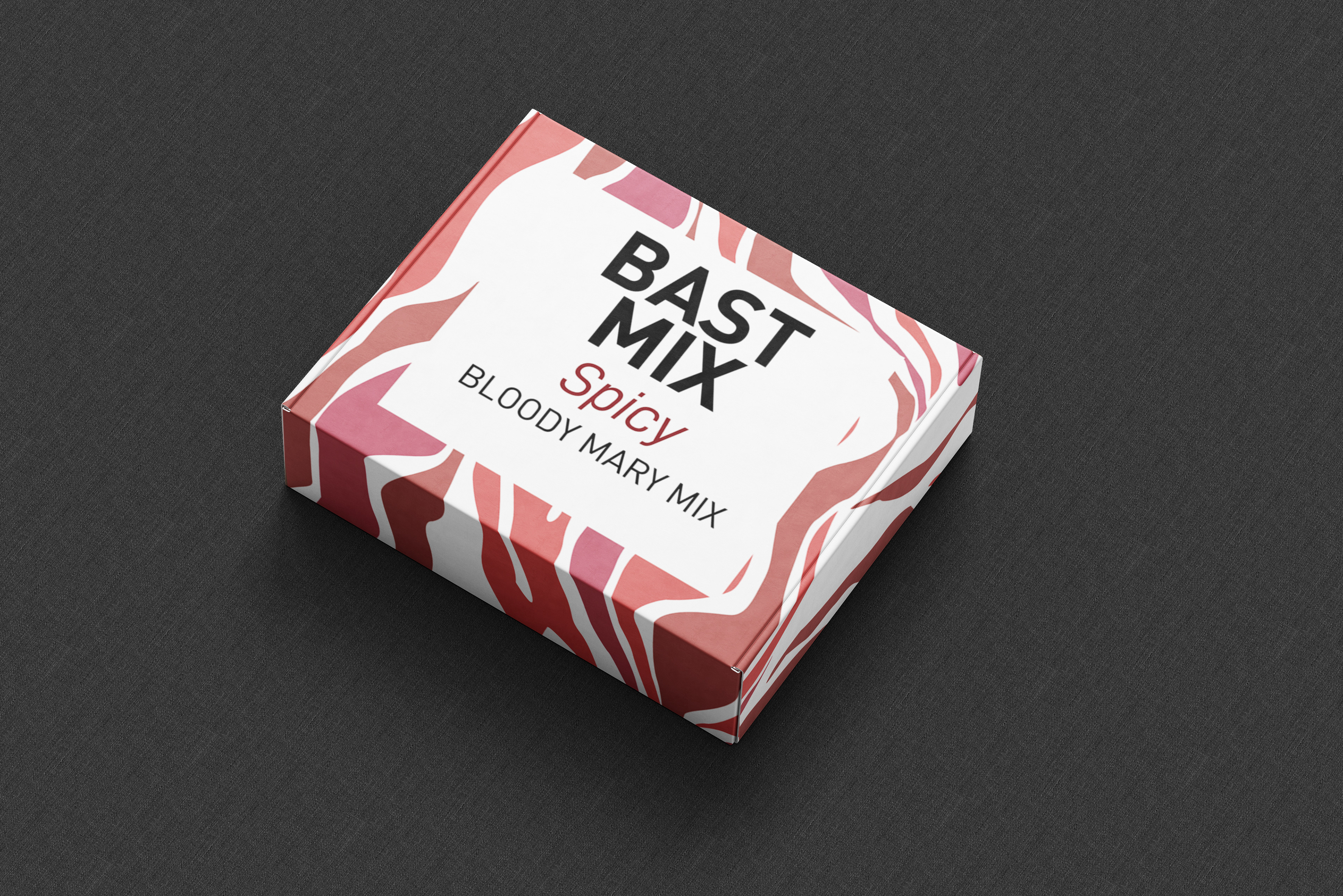
In conclusion Bloody Mary Mix is a great drink. It was a lot of fun to bring a family recipe to life. The pattern moves around the package and makes the user follow it. The type is bold and simple that stand out on its own.