MIKE AND IKE REDESING
It's candy time
BANDING, PACKAGING, and ILLUSTRATION
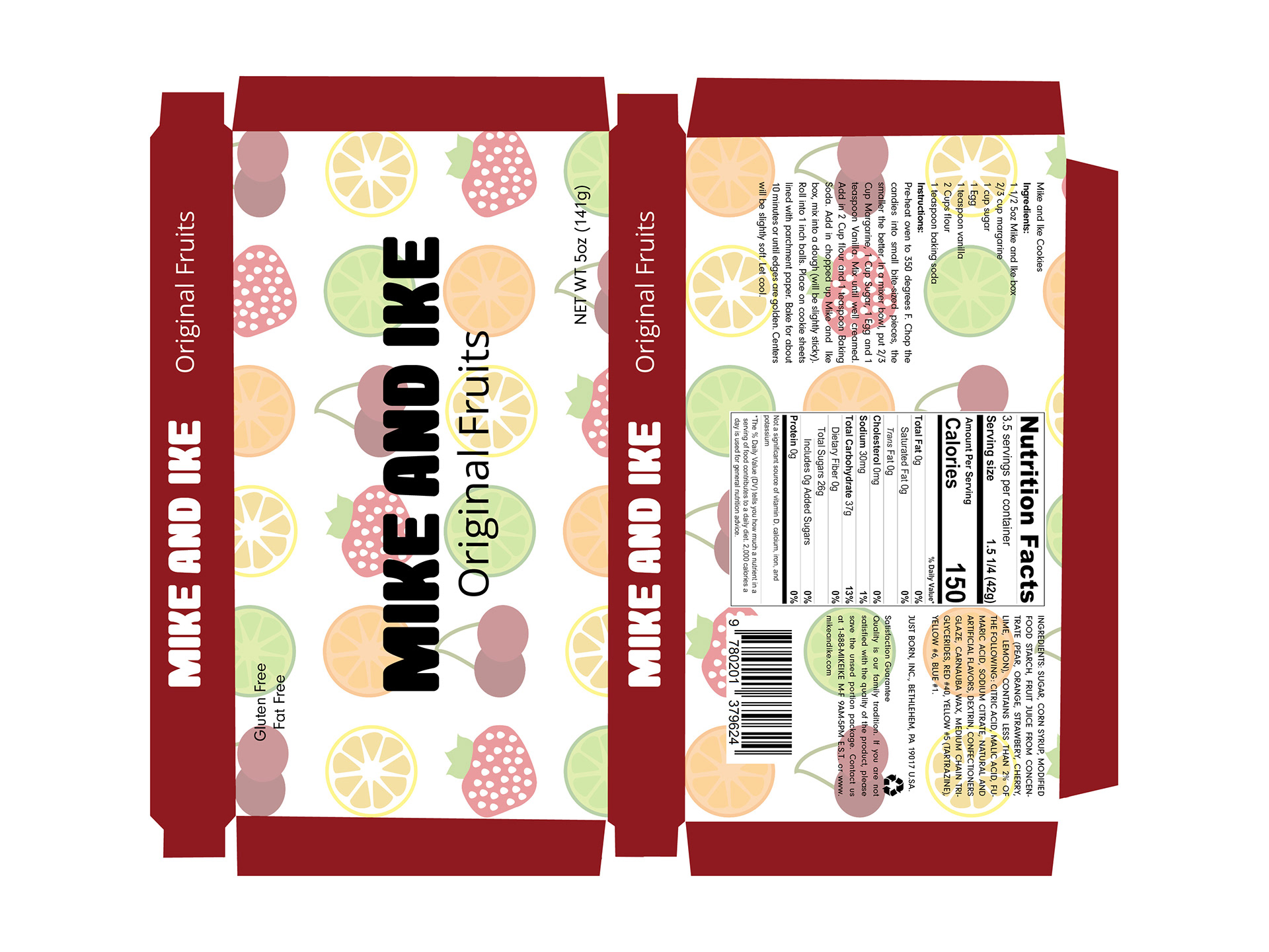
The challenge This project is about a rebrand design on MIKE AND IKE. MIKE AND IKE have been around for 77 years. Over that time it hasn't gone with a rebrand in a long time. The old design just had one color and the type was to mussing. So I had to come up with a way to make it pop out more in stores and make it more fun. Clean up the type so the customer can read it better.
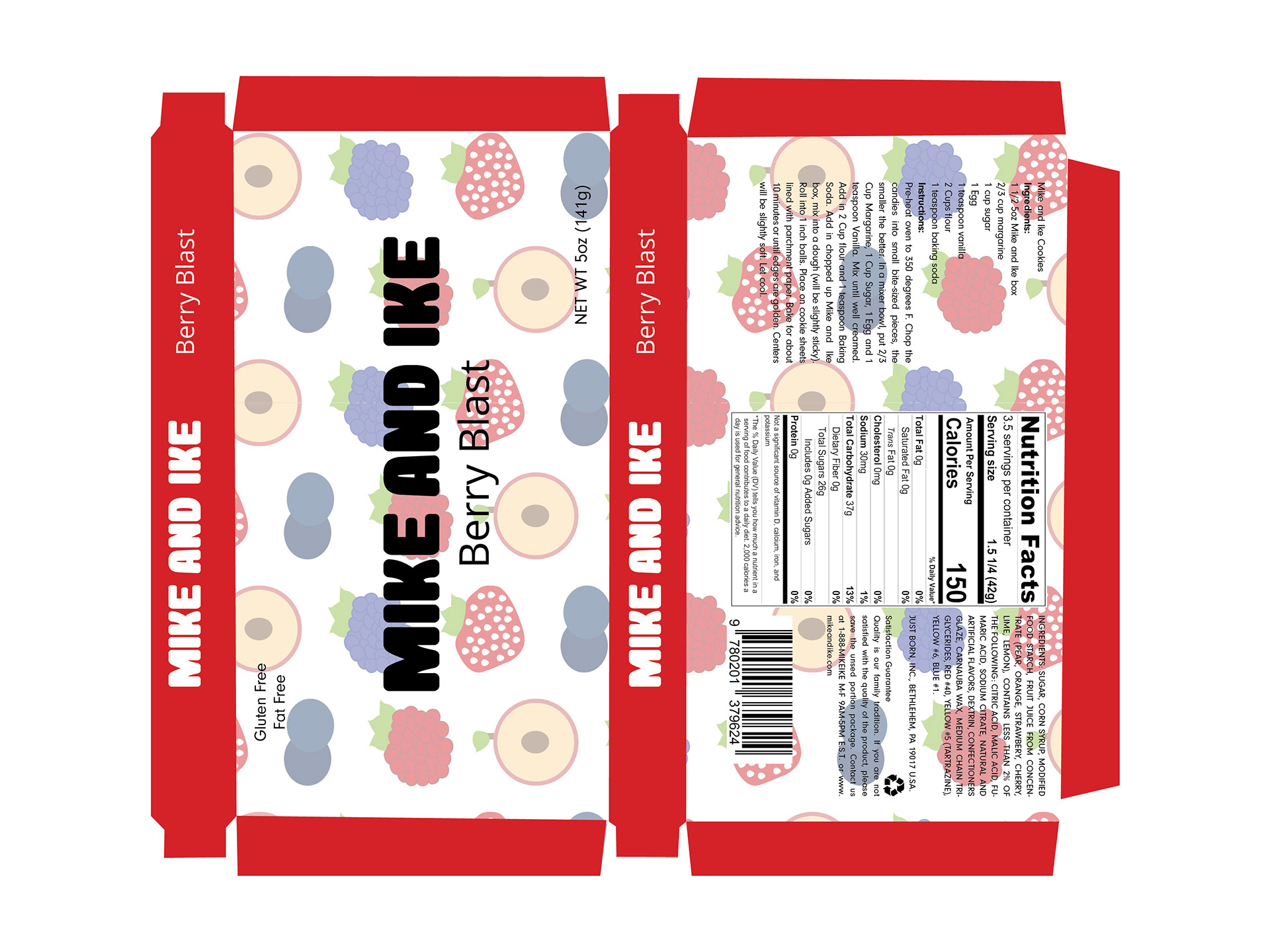
The solution So for the packing I design a pattern that shows what each flavor is in the packed. Also made a recipes that anyone could make cookies. Clean up the back so that it is easier to read. Put color on each sides so that people can tell what each different package is.
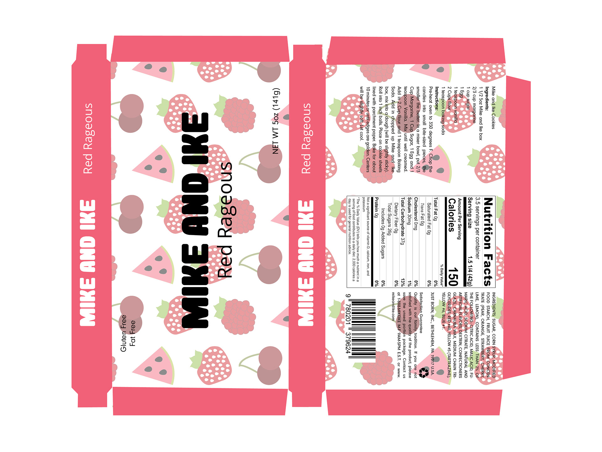
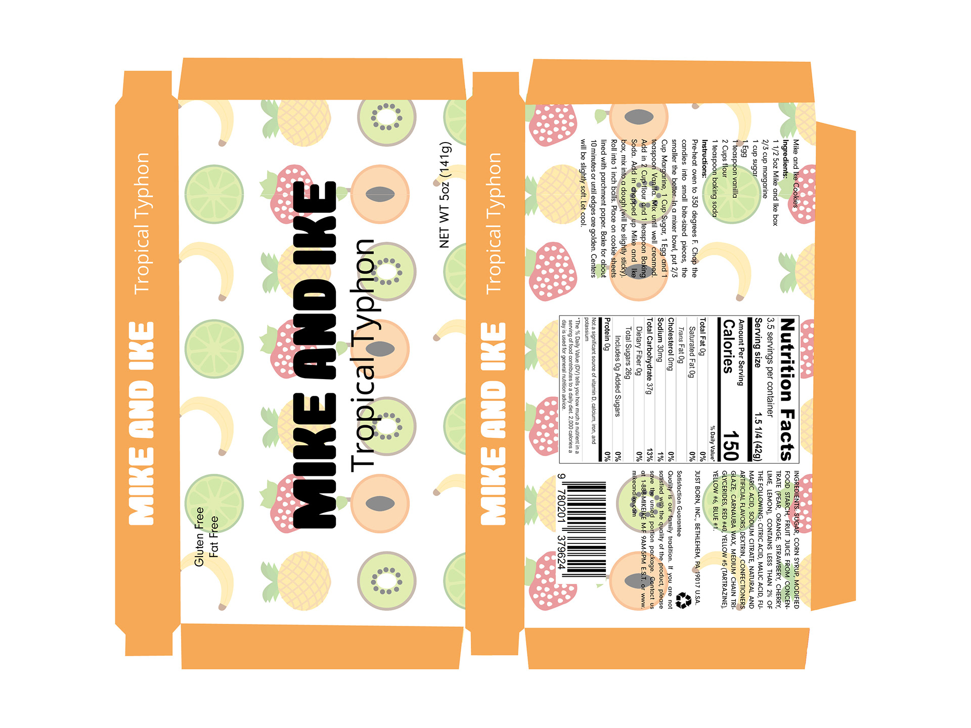
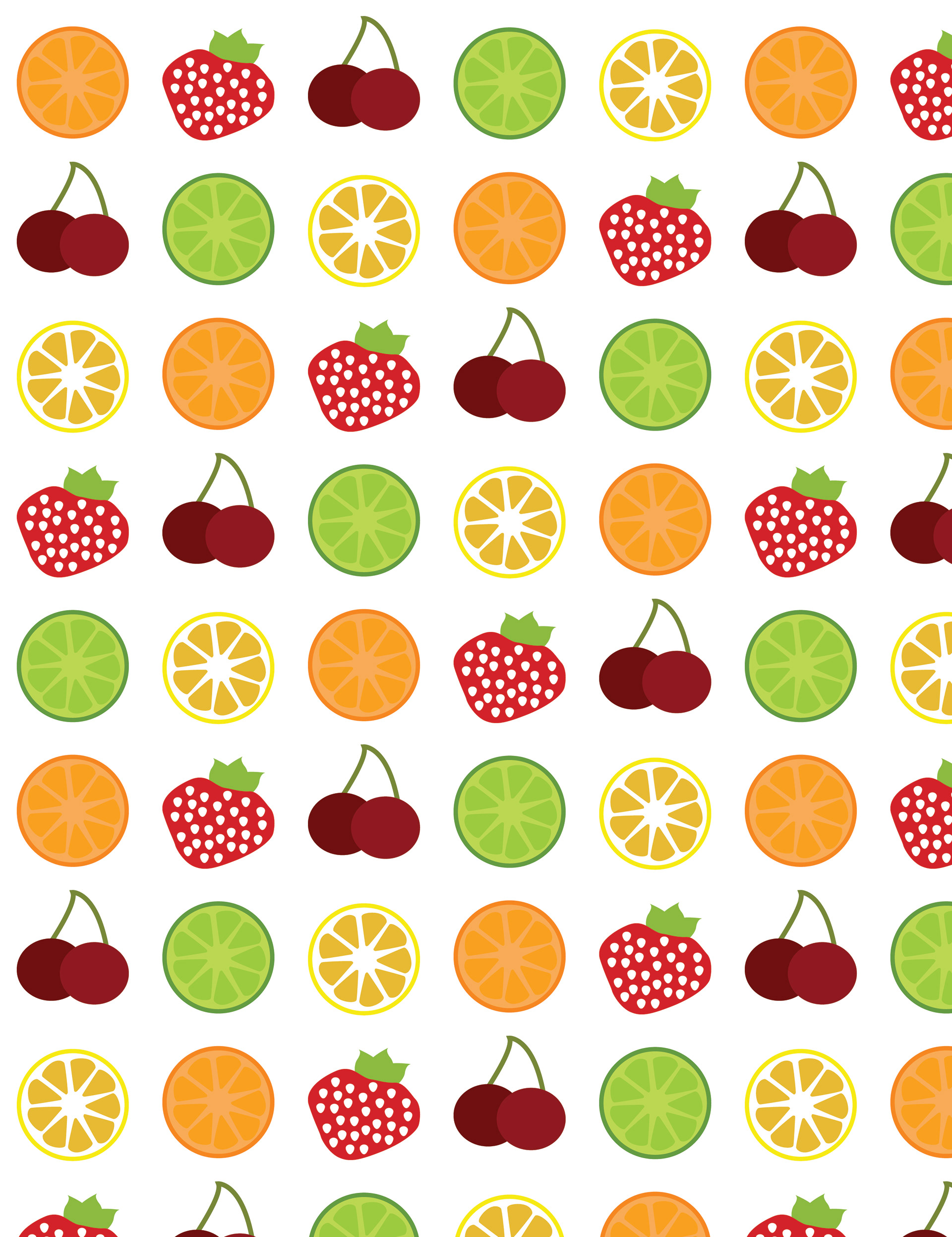
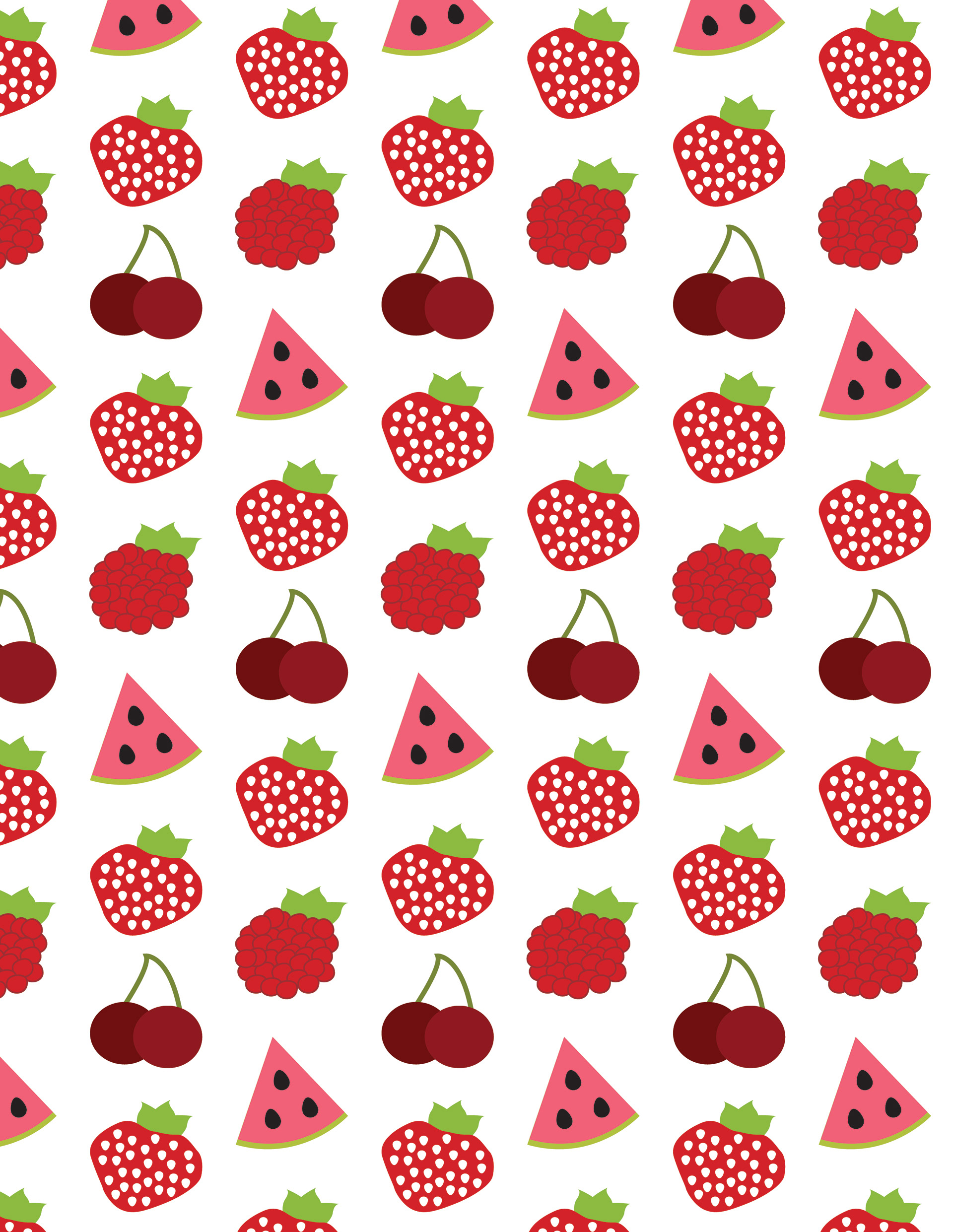
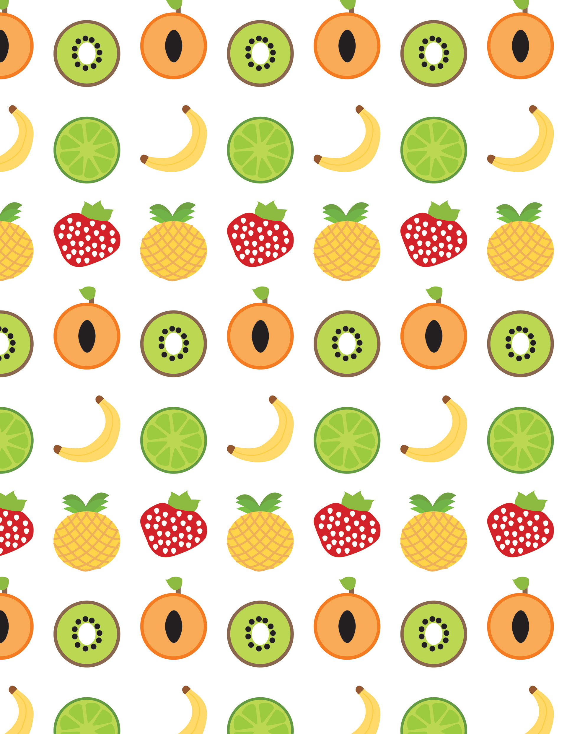
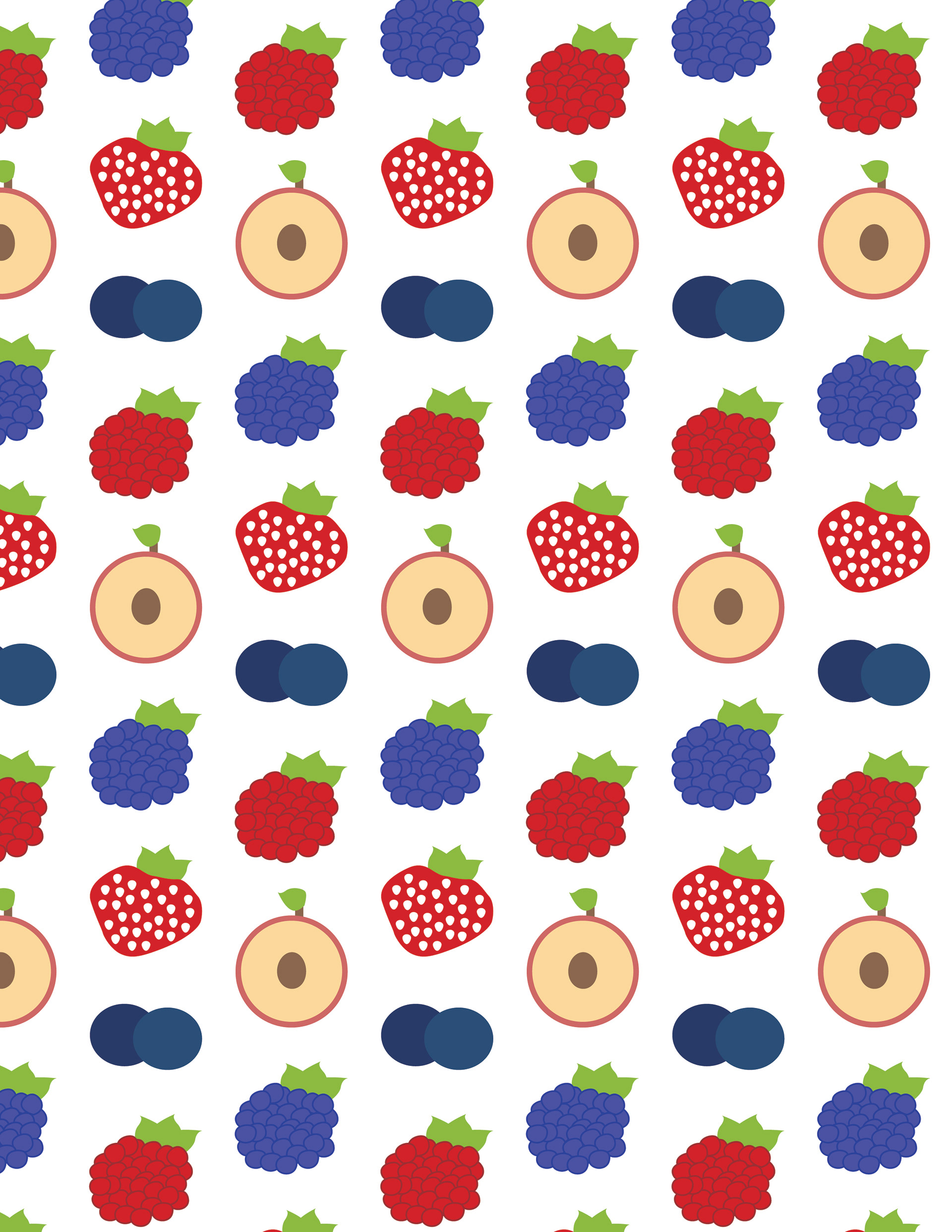
The Fruit Pattern
In conclusion This design gives off a fun package that you want to grab it and eat it. It had a fun pattern that bleeds off the packages. It is also eay to read.